SonWave Logo Design
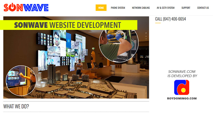
SonWave.com, a company based in Toronto, Canada, that helps and provides to its clients cost effective means, reliable and better technology to communicate to the world. It has 3 main services: Phone System, Network Cabling, and AV and CCTV System.
The owner of SonWave suggested a red-blue theme and he informed me that “son” and “wave” should be separated by the sad colors. And since this is related to electronics work, I made the “o” of “son” to look like a “power-on” button.
This is the final logo design,
![]()
Here’s the website of SonWave.